Please read this first. We print Bibles with white text on black pages. We are not doctors, and nothing here is medical advice, a diagnosis or a treatment. A page colour cannot cure or treat any condition. If light hurts your eyes, if your sight has changed, or if reading brings on headaches, please see an eye doctor (an optometrist or ophthalmologist) or your GP. New or worsening light sensitivity can be a sign of something that needs attention.
Many people say that reading white text on a black background feels calmer on their eyes. You see it in migraine forums, in concussion recovery groups, among people with low vision and among people who simply switch every screen to dark mode at night. Many others say the opposite: for them, white letters on black blur, shimmer or leave afterimages.
Both groups are describing something real. This guide brings together what readers report, what the research on reading and contrast actually shows, which readers may benefit and which may not, and how to test the format cheaply before spending money on anything, including our own black-page Bible.
The short answer
- For most people with typical vision, dark text on a light page is read slightly faster and more accurately, especially at small sizes. That is why most books are printed that way.
- For some readers, especially people who are sensitive to light or glare, people whose eyes scatter light (for example with cataracts or other clouding of the eye) and some people with low vision, light text on a dark background can be more comfortable, and in some low-vision studies it was read faster.
- For others, including many people with astigmatism, white text on black can look blurred, haloed or doubled, and some people with migraine find the high contrast itself uncomfortable.
- Comfort is personal. Two people with the same diagnosis can prefer opposite page colours. The only reliable test is to try both, at a sensible size, in good light, for long enough to notice how you feel.
At a glance
| Reader | Light on dark often feels | Main reason | Worth knowing |
|---|---|---|---|
| Light sensitivity (photophobia) | Easier for many | Less light reaches the eye | New sensitivity should be checked by a doctor |
| Migraine | Mixed | Less light, but high contrast can shimmer | Try short sessions and softer contrast |
| After a concussion | Easier for many, early on | Less light and glare | Long-term light avoidance can backfire |
| Cataracts or cloudy cornea | Often easier | Less scattered light and glare | The best-studied group; surgery treats the cause |
| Other low vision | Personal | Depends on the condition | Text size matters as much as colour |
| Astigmatism, keratoconus | Often harder | Wider pupil, halos and blur | Up-to-date glasses; a light page may suit better |
| Dyslexia, visual stress, visual snow | Mixed | Personal preference | Evidence for colour changes is contested |
| Typical vision | Comfort choice | Preference, evening reading | Dark on light is usually read slightly faster |
Why a dark page can feel easier
A white page reflects a lot of light into your eyes. A black page with white text reflects far less: most of what you look at is dark, and only the letters are bright. Three things follow from that, and they explain most of what readers describe.
Less light overall. For people whose eyes or brains are sensitive to light, the total amount of light can matter more than the sharpness of the letters. A mostly dark page simply sends less of it. This is the same reason people with light sensitivity turn down screen brightness.
Less scattered light. When the lens or cornea is cloudy, as with a cataract, light that enters the eye is scattered across the retina like light through a misted window. A bright white page fills the eye with that haze and washes out the dark letters. With white letters on black, there is much less light to scatter, so the letters can stand out more clearly. Researchers at the University of Minnesota described exactly this effect in readers with cloudy ocular media in 1985 (see the research below).
But a bigger pupil. The eye responds to a dark page by opening the pupil wider. A wide pupil, like a wide camera aperture, has less depth of focus and lets the eye's own imperfections, such as astigmatism, blur the image more. White letters can then appear to bleed into the black around them, an effect often called halation. This is the main reason a black page does not suit everyone.
Who may find it easier
These are the groups for whom light-on-dark reading is most often described as helpful. "May" matters in every line: none of this is guaranteed, and none of it replaces care from a professional.
People with light sensitivity (photophobia)
Light sensitivity is a symptom, not a condition in itself, and it has many causes, from migraine and dry eye to inflammation inside the eye. If bright pages or screens make your eyes ache or water, a darker page reduces how much light reaches you. Many people with photophobia already use dark mode, lower brightness and tinted lenses for the same reason. If light sensitivity is new, please have it checked before you work around it.
People with migraine
Sensitivity to light is one of the most common migraine symptoms, during attacks and often between them. Many people with migraine say bright white screens and pages are uncomfortable and that dark mode helps. Others with migraine find the stark contrast of white on black, or its flicker-like shimmer, to be a trigger. In the same migraine thread you will find both experiences (see what readers report). The Migraine Trust also points out that being more sensitive to light can be an early warning sign of an attack rather than its cause, and suggests regular screen breaks, adjusting brightness, anti-glare filters and good lighting. If you have migraine, try a black page for short sessions first and stop if you notice warning signs.
People recovering from a concussion
Light and screen sensitivity are common after a concussion, and recovery groups often recommend dark mode and lower brightness among their first adjustments. Clinical guidance adds an important caution: the concussion programme at GF Strong in Vancouver says dimming lights can help at first, but that too much long-term avoidance of light can make sensitivity worse, and advises gradually rebuilding tolerance and talking to a doctor if symptoms are not improving after four weeks. A black page can be a comfortable option while you recover; it should not become a reason to avoid light altogether without guidance from your care team.
People with cataracts or other clouding of the eye
This is the group the research speaks to most directly. When the lens or cornea scatters light, a white page produces glare that lowers contrast, and white text on black can be easier to read. If you have cataracts, glare from white pages is worth mentioning to your eye doctor. The US National Eye Institute notes that surgery is the only way to remove a cataract, and that early on brighter lighting, anti-glare sunglasses, magnifying lenses and an updated prescription can help. A black page is at most a comfort while you wait or decide.
People with low vision
Sight-loss organisations have long recognised "reversed" print as a valid choice. The RNIB's guide to colour and contrast notes that people whose eye conditions cause problems with glare often prefer light text on a dark background, while others prefer dark text on white or yellow, and that two people with the same condition may see colour very differently. Phones, tablets and computers all include colour inversion and high-contrast settings for this reason. For low vision, size matters at least as much as colour: a black page with small print will not help if the print is too small for you to read.
People who read in dim light or at night
Many people find a bright white page or screen harsh in a dark room and reach for dark mode in the evening. That is a comfort preference rather than a medical one, and research on screens suggests it is not automatically easier to read (more on that below), but it is a very common reason people like black pages.
People who simply prefer dark mode
Some readers have no diagnosis at all and just find a dark page calmer, more focused or easier to settle into. That is a perfectly good reason, as long as the text is large enough to read comfortably.
What readers report
These are individual experiences shared publicly on Reddit, not evidence of what will happen for you. We have summarised them in our own words and linked each one so you can read it in context. They are worth reading precisely because they disagree.
- Migraine, for: in an r/migraine thread asking whether dark mode triggers anyone, the most-upvoted reply said the opposite, dark mode for everything. Others in the thread said bright white can make a migraine worse, and one reader who keeps every device dark at 30–50% brightness wrote: “It was such a game changer for me once devices started doing dark mode option” (r/migraine).
- Migraine, against: the person who started that thread said dark mode in any app brought on motion sickness or a migraine; another found the contrast painful and saw tracers after reading in dark mode; another said white letters on black seem to jump around and that even in light mode they had to turn off the red letters in their Bible. One reader found grey or soft tan text on black easier than pure white.
- Concussion: in r/PostConcussion and r/Concussion, people describe dark mode on every device as part of living with light sensitivity, and recommend dark mode plus the lowest comfortable brightness, short reading blocks and text-to-speech. Another reader suggests going further: dark mode, lower brightness and slightly softer contrast.
- Low vision: readers in r/LowVision describe white or yellow text on black or dark grey as helpful, and a reader in r/Blind who uses a high-contrast theme says they avoid anything that is not on a black or very dark background. Another low-vision reader lists red on black among the colour combinations that are hard to read.
- Astigmatism, mostly against: in r/astigmatism, one reader describes halos, doubling and blurring in dark mode, like street lights at night, and now uses light mode everywhere; another with severe astigmatism says white words on black smear into a single line. A Kindle reader says bright white text on black hurts their astigmatic eyes, and only reads in dark mode with the warm light on.
- Astigmatism, for: not everyone with astigmatism agrees. Another Kindle reader with astigmatism, amblyopia and short sight finds white text on black easier on the eyes.
- Visual snow: one reader with visual snow finds that dark mode helps and distracts less; another gets afterimages from dark-mode text.
- Dyslexia: one dyslexic reader says lighter letters on a darker background help separate the letters; another says in dark mode the bright letters start jumping, and prefers a pale green background.
- Keratoconus: readers with keratoconus mention putting PDFs into dark mode and zooming in, and using high-contrast settings on computers.
The pattern is consistent: people who are troubled mainly by too much light or glare tend to prefer dark pages, while people troubled mainly by blur, halos or visual "noise" often do not. Many in both groups find that softening the contrast (grey, cream or warm text rather than pure white) makes the difference.
What the research says
The research is more balanced than either side of the dark-mode debate usually admits.
For typical vision, dark on light usually wins on performance
Studies led by Axel Buchner and colleagues at the University of Düsseldorf have repeatedly found a "positive polarity advantage": people with normal or corrected vision proofread more accurately with dark text on a light background. Piepenbrock, Mayr, Mund and Buchner (Ergonomics, 2013) found this advantage in both younger adults and adults aged 60 to 85, none of whom had eye disease. A follow-up in Human Factors found the advantage grows as text gets smaller. The usual explanation is pupil size: a bright page narrows the pupil and sharpens focus. The Nielsen Norman Group's review of this research also describes a study of quick glances at screens in which polarity made no significant difference in simulated daylight, while at night light mode did better, especially for small text. It notes that participants did not feel any difference in readability even when their scores differed, which is a useful reminder that comfort and performance are not the same thing.
For eyes that scatter light, light on dark can be faster
The classic low-vision study is Legge, Rubin, Pelli and Schleske, "Psychophysics of reading II: Low vision" (Vision Research, 1985). Of 16 low-vision readers, those with cloudy ocular media (such as cataracts or corneal clouding) reached peak reading speeds 10–50% faster with white text on black. Readers with clear ocular media showed little difference, except near the limit of what they could see. The authors attribute the effect to light scattering inside the eye, which lowers the contrast of dark letters on a white page much more than that of white letters on black.
Comfort and preference are real, but less studied
There is much less research on long, comfortable reading by people with migraine, concussion or photophobia than there is on proofreading speed in healthy eyes. Guidance from low-vision and concussion services is practical rather than definitive: try options, reduce glare, adjust brightness, and choose what works. The RNIB's colour and contrast guide puts it plainly: colour preference is very personal.
Coloured overlays and visual stress: mixed evidence
Some readers come to dark pages through Irlen syndrome, "visual stress" or coloured overlays. The evidence there is genuinely contested. A 2016 systematic review by Griffiths and colleagues found most studies of coloured overlays and lenses at high risk of bias and concluded their use for reading difficulties could not be endorsed, while other researchers disagree and call for larger trials. Dyslexia guidance generally recommends dark text on a soft, non-white background, with the reader's own preference respected. If a different page colour helps you read more comfortably, there is no harm in using it, but it is not a treatment for dyslexia.
A note on long-term effects
A small 2018 study from the University of Tübingen (Aleman, Wang and Schaeffel, Scientific Reports) measured how a layer at the back of the eye changed in seven people after an hour of reading each kind of text, and raised the possibility that long-term reading of dark text on white may be linked to short-sightedness. It is an early, small study and should not guide anyone's choices on its own; we mention it only because it is often quoted, sometimes as if it proved more than it does.
Who it may not suit
- Many people with astigmatism, keratoconus or significant short sight see halos, doubling or blur around light text on dark backgrounds, because the wider pupil magnifies the eye's own focusing errors. Some still prefer it; many do not. Up-to-date glasses help either way.
- Some people with migraine, visual snow or pattern sensitivity find high-contrast white-on-black text shimmers, "jumps" or leaves afterimages. Softer contrast often helps; for some, a cream or light page is simply better.
- Readers who need small print, because the light-page advantage grows as text gets smaller. If you read white on black, choose a comfortable size.
- Long study sessions for readers with typical vision, where the evidence favours dark on light for accuracy. Many people switch: a white page for detailed study, a dark one for slower, reflective reading or the evening.
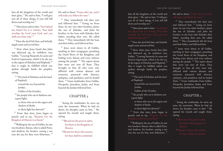
- Coloured text on black. Red text on black has lower contrast than white on black. In our own Black Edition, the words of Jesus are printed in red; some readers with low vision or colour-vision deficiency may find those passages harder to read than the white text, and should check the sample before buying.
- Anyone with new symptoms. If light sensitivity, glare, halos or headaches are new, sudden or getting worse, the right step is an eye examination, not a different book.
How to try it before you buy anything
You can test light-on-dark reading for free in a few minutes:
- On a phone or tablet: turn on dark mode, or use the accessibility setting that inverts colours (on iPhone, Smart Invert or Classic Invert under Accessibility, Display and Text Size; on Android, Colour inversion or Dark theme). Many e-readers, including Kindle, offer white text on a black page.
- Read the same passage twice: about ten minutes in each mode, at the same size, brightness and time of day. A long passage you know well works best, because you can attend to comfort rather than meaning.
- Notice how you feel afterwards, not just during: eye ache, headache, afterimages, how quickly you lose your place, and whether you want to keep going.
- Repeat on another day. Many conditions vary from day to day; a single test can mislead.
- Check a real page. Screens give off light while paper reflects it, so a printed black page looks softer than a black screen. Our 20-page Black Edition sample lets you see the actual typography; read it at its true size on a screen turned well down, or print a page on matte paper.
If you are seeing an eye doctor, low-vision service or concussion clinic, take the result with you. They can tell you whether it fits what they know about your eyes.
Making a black page as comfortable as possible
- Light the page, not your eyes. Paper does not glow, so a black page needs good, even light on it. A lamp to the side or slightly behind you, rather than one shining toward your face, reduces glare. Warmer light is often more comfortable for light-sensitive readers.
- Prefer matte to glossy. Glossy black paper reflects lamps and windows as bright streaks. A matte page scatters that reflection.
- Choose a comfortable size. The RNIB’s contrast guidance is written around 14 point type, and many readers with low vision need larger. If a book's type is too small for you, a magnifier or a digital version you can enlarge will help more than any page colour.
- Soften the contrast on screens. If pure white on pure black glares, try off-white or warm text on dark grey, lower the brightness, and add warm or night-shift colour.
- Take breaks. Look into the distance every twenty minutes or so; this helps tired eyes whatever the page colour.
- Keep your glasses up to date. Uncorrected astigmatism makes halation worse. Mention to your optician that you read light text on dark pages.
Questions readers ask
Is white text on a black background better for your eyes?
Not for everyone. For most people with typical vision, dark text on a light page is read slightly faster and more accurately, especially at small sizes. Some readers, particularly people who are sensitive to light or glare, people with cataracts or other clouding of the eye, and some people with low vision, find light text on a dark page more comfortable, and in one low-vision study readers with cloudy eyes read 10 to 50% faster that way. It is a comfort choice, not a treatment.
Can dark pages help with migraine?
Many people with migraine say that bright white pages and screens are uncomfortable and that dark mode helps them read for longer. Others with migraine find high-contrast white text on black uncomfortable or a trigger. A page colour is not a migraine treatment. If you want to try it, read for short sessions at first, and talk to your doctor about light sensitivity, which is common in migraine.
Is dark mode bad if I have astigmatism?
It can be. Many people with astigmatism see halos, doubling or blur around light text on a dark background, because the pupil opens wider on a dark page and focusing errors show more. Some people with astigmatism still prefer it. Up-to-date glasses, softer contrast (off-white text on dark grey) and good lighting all help. If dark pages blur for you, a light page is the better choice.
Does reverse contrast help with cataracts or low vision?
It can. When the lens or cornea is cloudy, light scatters inside the eye and a bright white page produces glare. Sight-loss organisations such as the RNIB note that people whose conditions cause glare often prefer light text on a dark background. Text size matters as much as colour, and cataract glare is worth raising with your eye doctor, because surgery treats the cause.
Will a black-page book help after a concussion?
Some people recovering from a concussion find bright pages and screens uncomfortable and use dark mode and lower brightness while they recover. Concussion services also warn that avoiding light too much for too long can make sensitivity worse, and advise rebuilding tolerance gradually and seeing a doctor if symptoms are not improving after about four weeks. A darker page can be a comfortable option, alongside your care team’s advice.
Do coloured or dark backgrounds help with dyslexia or Irlen syndrome?
Some readers with dyslexia or visual stress say a particular background colour makes reading more comfortable, and there is no harm in using what you prefer. The research evidence for coloured overlays and lenses is mixed and contested, and a page colour is not a treatment for dyslexia. Dyslexia style guides usually suggest dark text on a soft, non-white background.
How can I test whether light-on-dark reading suits me?
Turn on dark mode or colour inversion on your phone or e-reader and read the same passage for about ten minutes in each mode, at the same size and brightness. Notice how your eyes and head feel afterwards, repeat on another day, and look at a printed or full-size sample of the book you are considering before you buy.
Should I see an eye doctor?
Yes, if light hurts your eyes, if glare, halos or headaches are new or getting worse, or if you are struggling to read. An optometrist or ophthalmologist can check for causes such as cataracts, dry eye or an out-of-date prescription, and can tell you whether reverse contrast fits your eyes.
If you would like to read Scripture this way
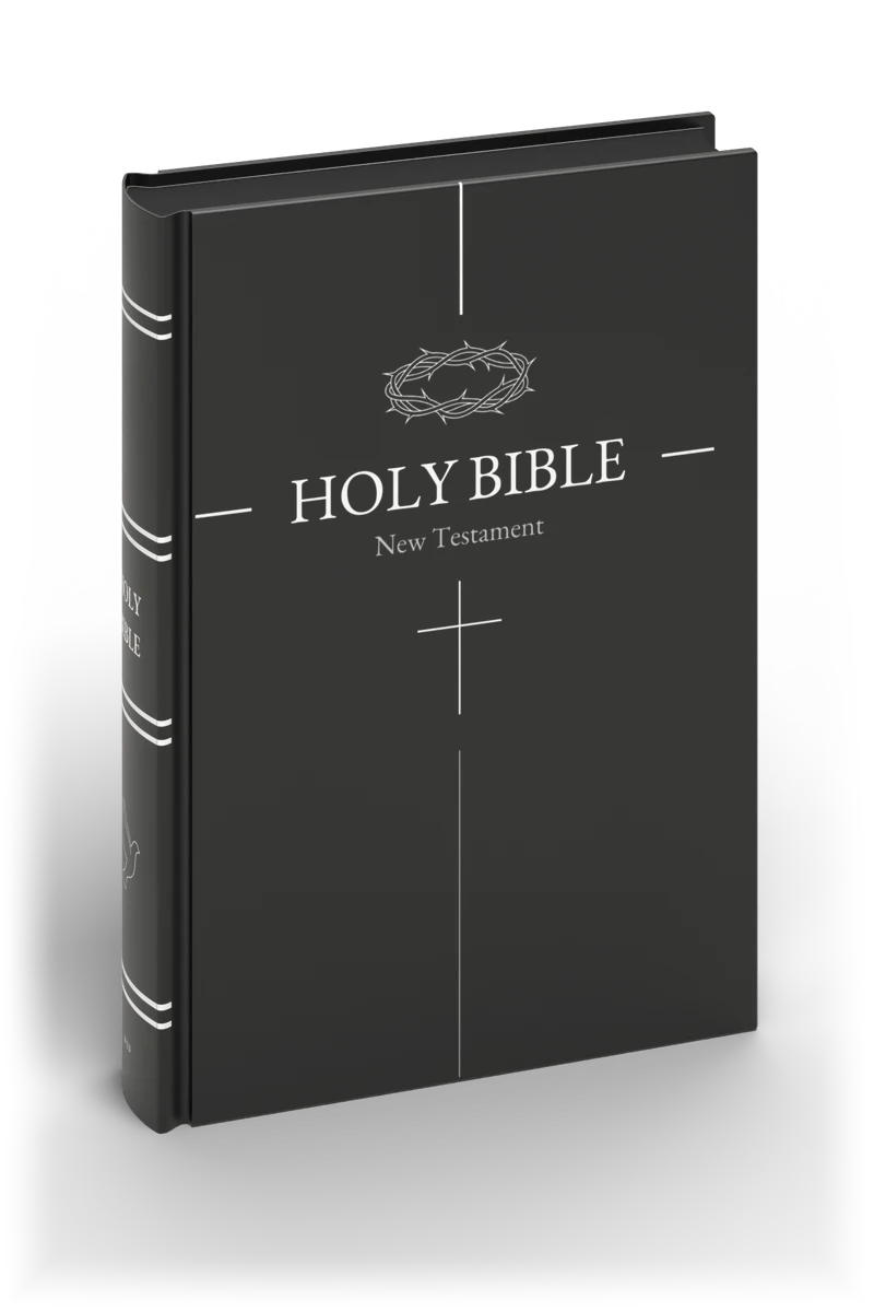
We started printing the Black Edition because we wanted a Bible that felt calm and beautiful to read, and because many readers describe white text on black as easier on their eyes. If you have tested light-on-dark reading and it suits you, here is what we make. If it does not suit you, our White Edition is the same New Testament on white pages.
The Black Edition
- The complete New Testament, all 27 books, in the text you choose: the World English Bible, a modern public-domain translation, the King James Version, the German Lutherbibel of 1912 or the Danish New Testament of 1907, all available now.
- White text on black pages, two columns of EB Garamond, with the words of Jesus in red. Please check that the red passages are comfortable for you in the sample.
- A5, about 148 × 210 mm, 432 pages, with a matte cover. Softcover $60, hardcover $80.
- An eBook for $10: a PDF of the same black pages, which stays black on any screen, and an ePub in the same look, where you can enlarge the text as far as you need.
See every page option and the actual interior on the Black Edition page, or read our Black-Page Bible Guide for more about the book itself. Whatever you choose, we hope you find a way of reading that rests your eyes.
How we wrote this guide
We read the studies and guidance listed below, some in full and some through their published abstracts and reviews of them, and checked each reference against its publisher’s record. The reader reports come from public Reddit threads we read in October 2026; we summarised them in our own words and link to every one. This guide has not been reviewed by a clinician, which is one more reason to treat it as a starting point for a conversation with your eye doctor rather than advice. If you spot an error, or you are a clinician who would like to suggest a correction, please write to contact@premiumblackbible.com and we will update the page.
Sources
- Legge GE, Rubin GS, Pelli DG, Schleske MM. Psychophysics of reading II: Low vision. Vision Research 25 (1985): 253–265. doi.org/10.1016/0042-6989(85)90118-X
- Piepenbrock C, Mayr S, Mund I, Buchner A. Positive display polarity is advantageous for both younger and older adults. Ergonomics 56 (2013): 1116–1124. doi.org/10.1080/00140139.2013.790485
- Piepenbrock C, Mayr S, Buchner A. Positive display polarity is particularly advantageous for small character sizes. Human Factors 56 (2014): 942–951. doi.org/10.1177/0018720813515509
- Budiu R. Dark Mode vs. Light Mode: Which Is Better? Nielsen Norman Group, 2020. nngroup.com/articles/dark-mode
- RNIB. Colour and contrast for people with sight loss, 2020. rnib.org.uk (PDF)
- GF Strong Teen Concussion, Vancouver Coastal Health. Light sensitivity. teenconcussion.vch.ca
- All About Vision. Is dark mode better for your eyes? (halation and astigmatism). allaboutvision.com
- The Migraine Trust. Migraine attack triggers (screens, light and warning signs). migrainetrust.org
- National Eye Institute. Cataracts. nei.nih.gov
- Griffiths PG, Taylor RH, Henderson LM, Barrett BT. The effect of coloured overlays and lenses on reading: a systematic review of the literature. Ophthalmic and Physiological Optics 36 (2016): 519–544. White Rose eprint
- Aleman AC, Wang M, Schaeffel F. Reading and myopia: contrast polarity matters. Scientific Reports 8 (2018): 10840. doi.org/10.1038/s41598-018-28904-x
- Reader reports: public Reddit threads in r/migraine, r/Concussion, r/PostConcussion, r/LowVision, r/Blind, r/astigmatism, r/kindle, r/visualsnow, r/Dyslexia and r/Keratoconus, linked above, read in October 2026.