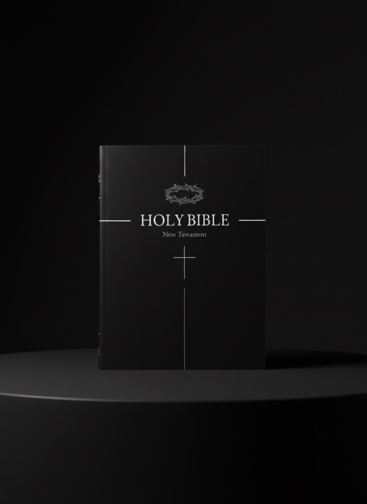
In a world saturated with color, noise, and constant visual stimulation, the decision to strip everything away feels radical. It is an act of subtraction rather than addition. The creation of the Monochrome Bible was not merely an aesthetic choice; it was a theological one.
The Theology of Contrast
"In the beginning God created the heaven and the earth. And the earth was without form, and void; and darkness was upon the face of the deep." (Genesis 1:1-2).
Our faith begins in distinction—the separation of light from darkness. By presenting the Scripture in pure black and white, we return to this primordial contrast. There are no distractions, no unnecessary flourishes. There is only the Word, cutting through the void. The stark white text on the deep black page is not just a reading experience; it is a visual representation of light shining in darkness.
Focus in an Age of Distraction
Modern Bible apps are often cluttered with notifications, social sharing buttons, and colorful highlights. While useful, these features can sometimes pull the mind away from the text itself. The Monochrome Edition is designed for deep work and deep prayer. It is a sanctuary for the eyes.
When you read in monochrome, the brain settles. The eyes relax. The text takes center stage, allowing the rhythm of the King James English to breathe. It is an experience akin to entering a dimly lit cathedral—a space designed for reverence.
Timelessness
Trends in design fade. Gradients, neons, and flat design styles come and go. But black and white is eternal. It exists outside of trend cycles. By adhering to this strict palette, we ensure that this digital edition feels as relevant in fifty years as it does today. It is built to last, just like the words it contains.